
How to Choose Tile Colour for Your Home
Learn how to choose tile colour for your home. Compare warm and cool tones, explore light and dark tiles, and coordinate colours with your existing finishes.
Choosing a tile colour sounds easy until you walk into a showroom and see hundreds of options.
White, cream, beige, grey, taupe, black, brown, stone-inspired colours and marble-look patterns all offer different possibilities.
The challenge is not simply finding a tile colour you like. It is choosing one that works with your home's existing finishes, lighting and overall design.
Whether you are updating a bathroom, planning a kitchen renovation or selecting flooring for an open-concept space, the right colour can help bring the entire room together.
This guide explains how to choose tile colour by considering undertones, lighting, room size, maintenance and the materials already in your home.
Start With the Materials You Have Already Chosen
One of the easiest ways to choose tile colour is to start with the finishes that are already in place.
If your cabinets, countertops or flooring have been selected, use them as your starting point rather than choosing tile in isolation.
Bring samples of the following materials when comparing tile options:
Cabinet doors and drawer fronts
Countertop samples
Wall paint or colour swatches
Existing flooring
Hardware and fixtures
Other tiles or decorative finishes
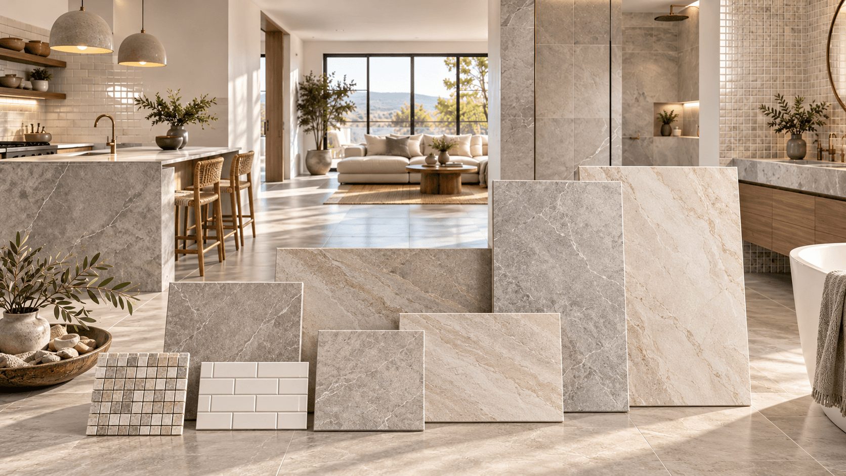
Place the samples beside the tile to see how the colours work together.
For example, a white tile with a cool grey undertone may complement a crisp white countertop but look noticeably different beside warm cream cabinetry.
If you are still comparing materials, our Tile Buying Guide GTA: How to Choose the Right Tile for Your Home explains the key factors to consider when selecting tile for your project.
Understand Warm and Cool Tile Colours
Tile colour is not always as straightforward as it appears. Many tiles have subtle undertones that become more noticeable when placed beside other materials.
Warm colours typically include beige, cream, ivory and brown tones. Cool colours often include blue-grey, crisp white and certain stone-inspired shades.
However, two tiles that appear to be the same colour can have very different undertones.
For example, one white tile may have a creamy appearance, while another may lean towards blue or grey. Similarly, some beige tiles look golden and warm, while others appear more muted or grey.
When choosing tile, consider whether you want to coordinate with the existing undertones in the room or introduce a deliberate contrast.
Grout colour can influence how your finished tile looks. For more ideas, read The Spruce's guide to choosing grout colour, which explains how matching and contrasting grout can change the overall appearance of a tiled surface.
Choose Light Tile for a Bright, Open Appearance
Light-coloured tile can help create a bright, airy appearance, particularly when paired with suitable lighting and complementary finishes.
Popular choices include:
White and soft white
Cream and ivory
Beige and light taupe
Pale grey
Light stone-inspired colours
These colours can work well in compact bathrooms, smaller kitchens, darker rooms and interiors where you want a clean, understated look.
Light tile can also help create visual continuity when used across connected spaces. For example, a consistent light-coloured floor can help an open-concept kitchen and living area feel more cohesive.
However, a light tile will not automatically make a room feel larger. Natural light, artificial lighting, tile size, grout colour and the surrounding finishes all contribute to the overall effect.
Use Dark Tile to Create Contrast
Dark tile can add depth, contrast and visual interest to a room.
Popular options include charcoal, black, deep grey and rich brown. Depending on the finish and surrounding materials, these colours can suit contemporary bathrooms, modern kitchens, entryways and feature walls.
For example, charcoal floor tiles can create a strong contrast against white walls and light cabinetry. Dark wall tiles can also provide a dramatic backdrop for metallic fixtures or warm wood finishes.
If you are using dark tile across a large area, consider how it will work with the room's lighting and other finishes. Pairing darker surfaces with lighter materials can help maintain visual balance.
The goal is to create a deliberate contrast rather than make the room feel visually heavy.
Consider Neutral Tile Colours for Long-Term Flexibility
Neutral tile colours remain a practical option for homeowners who want flexibility as their interior design evolves.
Beige, taupe, cream, soft white, grey and natural stone-inspired shades can work across a range of traditional and contemporary interiors.
A neutral floor or wall can also make it easier to update furniture, paint colours, lighting and accessories without replacing the tile.
However, neutral does not have to mean plain. Variations in texture, veining, pattern and finish can add character while keeping the overall colour palette understated.
For a more refined look, consider how the tile's undertone works with cabinetry, countertops and other permanent finishes.
Should Floor Tile Match Wall Tile?
Floor and wall tiles do not have to match exactly. The important thing is that the colours and finishes work together.
Using the same tile on the floor and walls can create a continuous appearance, while complementary colours can introduce contrast and visual depth.
Consider combinations such as:
Light floor tile with darker shower walls
Marble-look flooring with simple white wall tile
Wood-look floor tile with a stone-inspired backsplash
Neutral floor tile with a decorative accent wall
You can coordinate the tiles through a shared undertone, a similar colour family or a deliberate contrast in shade and pattern.
For kitchen projects, explore our guide to Kitchen Backsplash Tiles GTA for ideas on coordinating backsplash tile with cabinetry and countertops.
Consider How Lighting Changes Tile Colour
Lighting can significantly affect how a tile appears in your home.
A tile viewed under bright showroom lighting may look different in a bathroom with limited natural light or a kitchen with warm artificial lighting.
Consider how your room looks during:
Morning daylight
Afternoon sunlight
Evening lighting
Artificial lighting after dark
The direction a room faces and the type of light bulbs you use can also influence how warm or cool a colour appears.
Before making your final choice, take a physical sample home and view it in the space where it will be installed. Compare it with your cabinetry, countertops, wall colours and other finishes at different times of day.
For additional background on how lighting influences colour, see Benjamin Moore Canada's guide to warm and cool colours.
Think About Room Size and Tile Format
Colour and tile size work together to influence the overall appearance of a room.
Light colours can contribute to an open, bright look, while dark colours can create contrast and make a design feel more dramatic. Larger-format tiles can also reduce the number of visible grout joints, creating a more continuous surface.
For example, a light-coloured large-format porcelain tile may suit a contemporary bathroom or an open-concept living area where you want a streamlined appearance.
Smaller tiles can introduce more pattern and detail, making them useful for decorative features, shower floors and backsplashes where the selected product is suitable for the application.
If you are considering larger tiles, read our guide to Large-Format Bathroom Tiles in the GTA for more information on formats and design considerations.
Choose Tile Colours With Maintenance in Mind
The colour and finish of a tile can affect how visible everyday marks become.
Very dark tiles may show dust, dried water droplets and certain residues. Very light tiles can make some spills or darker marks more noticeable, depending on the product and finish.
Mid-tone colours and tiles with natural-looking variation may make some everyday marks less noticeable, although this depends on the specific material and surface.
Before choosing, consider where the tile will be installed and how the room will be used.
For a busy kitchen or entryway, practical cleaning requirements may be just as important as appearance. In a bathroom, consider water marks, cleaning routines and whether the chosen tile is suitable for the intended application.
Colour alone does not determine maintenance. Porcelain, ceramic and natural stone have different care requirements, so check the manufacturer's guidance before making a decision.
Consider Marble-Look Tile for Added Character
Marble-look porcelain tile offers the appearance of marble-inspired veining in a manufactured tile.
Depending on the design, it can introduce subtle movement or a more dramatic pattern to bathrooms, kitchens, floors and feature walls.
White marble-look tile with grey veining can create a crisp, contemporary appearance, while warmer beige and taupe variations can complement cream cabinetry and wood finishes.
When choosing a marble-look design, consider the scale and intensity of the veining. A bold pattern may work well as a feature, while a more understated design may be easier to coordinate across a larger area.
Also compare samples where possible, since the pattern and colour variation can influence how the finished surface looks.
Explore Wood-Look Tile for Warmer Tones
Wood-look porcelain tile offers a way to introduce wood-inspired colour and pattern into a space.
Available colour families can include light oak, natural brown, warm honey, grey wood and deeper brown tones.
When choosing a shade, consider the cabinetry, furniture and other finishes in the room. A warm wood-look tile may coordinate well with cream cabinetry and warm neutrals, while a cooler grey-brown tone may suit a more contemporary palette.
Try to avoid selecting the colour based on the tile alone. Comparing it with the surrounding materials can help you decide whether the overall combination feels cohesive.
How to Choose Tile colour: Five Questions to Ask
Before finalizing your selection, ask yourself these five questions:
1. What colours are already in the room?
Start with permanent or expensive-to-change finishes, including cabinets, countertops, existing flooring and fixtures.
2. Are the undertones warm or cool?
Look beyond the main colour and check how the tile appears beside your other materials.
3. How much natural light does the room receive?
Compare samples in the actual room and under both natural and artificial lighting.
4. Do you want the tile to stand out or blend in?
Choose contrast for a more distinctive look, or complementary shades for a quieter, more continuous appearance.
5. How much maintenance are you comfortable with?
Consider the room's use, the tile's finish and the cleaning requirements of the material.
Answering these questions can help narrow your options before you make a purchase.
Compare Tile Colours in Person
Online images are useful for researching styles, but they should not be the only basis for choosing tile colour.
Screen settings, photography, lighting and surrounding materials can all affect how a tile appears on a display. Physical samples make it easier to compare undertones, surface finishes, patterns and colours side by side.
If possible, view the tile in the room where it will be installed before finalizing your selection.
Big M Stone & Tiles offers a showroom of more than 20,000 sq. ft., where homeowners, designers, contractors and builders can compare tile colours, materials, sizes and finishes in person.
Bring your cabinet, countertop and paint samples so you can assess how the options work together.
Final Thoughts
Choosing tile colour is about more than finding an attractive shade. It is about selecting a tile that complements the rest of your home and suits the way you use the space.
Start with your existing finishes, compare warm and cool undertones, consider the room's lighting and think about maintenance before making your final decision.
Most importantly, view the tile in person whenever possible.
The right tile colour is the one that works with the entire room, creating a finish you can enjoy for years to come.
Learn how to choose tile colour for your home. Compare warm and cool tones, expl...
Oct 30, 2026
Learn how to choose tile size for bathrooms, kitchens and open-concept spaces. C...
Oct 26, 2026

Learn how much extra tile to buy for your project. Calculate square footage, acc...
Oct 22, 2026
Learn how to choose tile colour for your home. Compare warm and cool tones, explore light and dark t...
Oct 30, 2026
Oct 26, 2026
Oct 22, 2026

Oct 18, 2026

Oct 15, 2026